


Is your website prepared for the era of mobile-first indexing? Learn about the significance of mobile SEO and discover strategies to optimize your site for mobile devices.
In recent years, search engines have emphasized the importance of enhancing mobile experiences for websites. With mobile traffic accounting for over 60% of web visits, and in some industries even up to 90%, the necessity to prioritize mobile optimization is undeniable.
Google’s transition to mobile-first indexing has made mobile optimization a paramount concern for website owners and SEO professionals alike. Additionally, a new benchmark called Interaction to Next Paint (INP) has replaced First Input Delay (FID) since March 12, 2024, adding a fresh dimension to mobile SEO strategies.
Understanding the latest advancements in mobile SEO, especially with the introduction of INP, is crucial for maintaining and improving website visibility in search engine results tailored for mobile users. This guide aims to provide actionable steps to effectively optimize your site for today’s mobile-centric SEO requirements.
Mobile SEO is aimed at optimizing your website to achieve better visibility in search engine results tailored specifically for mobile devices. This form of SEO not only seeks to improve search engine rankings but also focuses on enhancing the overall user experience for mobile users through both content and technology.
While mobile SEO shares similarities with traditional SEO practices, additional steps related to site rendering and content are necessary to meet the unique needs of mobile users and the speed requirements of mobile devices.
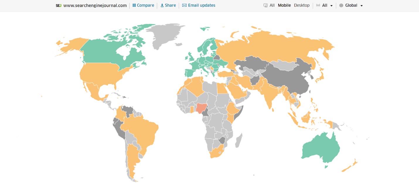
Consider this: 58% of the world’s web traffic originates from mobile devices. Ignoring the needs of mobile users means potentially missing out on a significant amount of traffic.
Since 2023, Google has prioritized mobile-first indexing with its crawlers. This means that the mobile experience of your site is crucial for efficient indexing, which precedes the application of ranking algorithms.
The proportion of traffic from mobile devices can vary based on factors such as your industry and the search intent your content addresses. While B2B sites might attract primarily desktop users, certain content may be preferred on desktops for larger purchases, for example.
Regardless of your industry or user search intent, optimizing your site for mobile devices is becoming increasingly important for future-proofing your online presence.
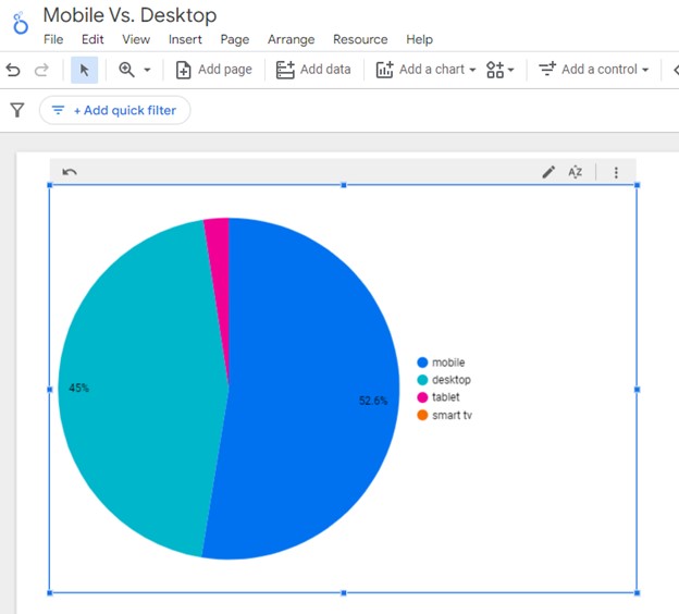
How can you assess your current mix of mobile vs. desktop users?
You can easily determine the percentage of your users accessing your site via mobile devices using Google Analytics 4:
The breakdown of the top device categories will align with the selected date range in GA4.

You can also set up a report in Looker Studio.
You can enhance your analysis by adding more dimensions to delve deeper into the data, such as identifying which pages attract which type of users, analyzing the mobile-to-desktop mix by country, and determining which search engines drive the most mobile users to your site.
Now that you understand how to create a report on mobile and desktop usage, it’s crucial to assess if your site is optimized for mobile traffic.
Although Google removed the mobile-friendly testing tool from Google Search Console in December 2023, there are still valuable tools available for evaluating your site’s mobile compatibility.
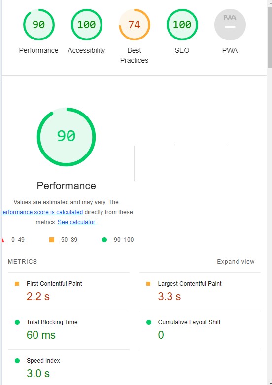
Google’s Lighthouse Chrome extension offers a comprehensive evaluation of your site’s performance across various factors, including load times, accessibility, and SEO.
To utilize Lighthouse Chrome extension:
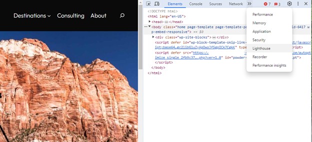
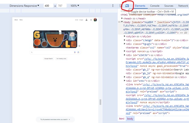
Another option for utilizing the Lighthouse report is through Developer Tools in Chrome:
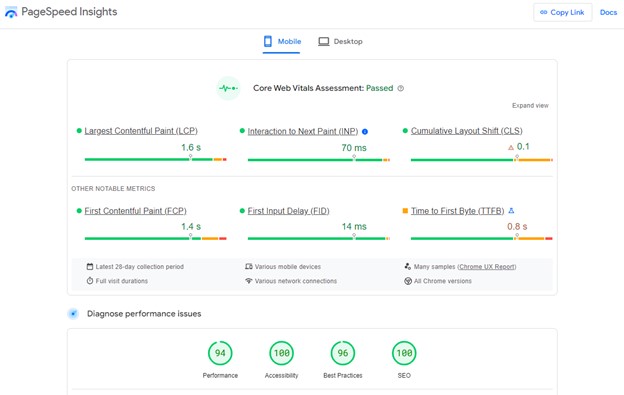
Google also provides another valuable tool called PageSpeed Insights (PSI) for assessing your website’s performance:
PageSpeed Insights will generate a report that integrates any Core Web Vitals scores, allowing you to understand the user experience your site offers and identify areas for improvement.
Another valuable tool for evaluating your website’s performance is WebPageTest.org:
With WebPageTest.org, you can identify which processes are causing delays in loading your pages, pinpoint the components with the longest loading times, and understand how these factors impact your overall page load times.
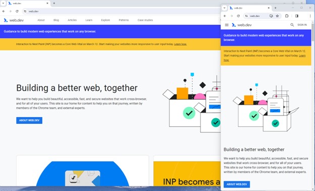
Furthermore, you can simulate the mobile experience using Developer Tools in Chrome:
Lastly, it’s essential to use your own mobile device to load and navigate your website. Here are some key considerations:
With the plethora of tools available, it’s crucial to monitor the Performance and Accessibility scores as they directly impact mobile users. By expanding each section within the PageSpeed Insights report, you can identify specific elements affecting your score, providing clear directives for your developers to optimize the mobile experience.
While mobile network speeds have improved globally over the years (the average speed in the U.S. has risen from 11.14 Mbps to 27.06 Mbps in just eight years), prioritizing speed and usability for mobile users remains critical.
Best Practices for Mobile Optimization
Unlike traditional SEO, which often revolves around aligning your language with user needs, mobile SEO tends to be more technical and SEO-heavy. While content alignment with user needs remains important, effective mobile search optimization necessitates collaboration with developers and designers.
Here are several key factors to consider for mobile SEO optimization:
The responsiveness of your site across different devices is crucial for mobile SEO. Two common approaches to achieve this are responsive design and dynamic serving.
Responsive design, the more prevalent option, leverages cascading style sheets (CSS), flexible layouts, responsive content delivery networks (CDN), and modern image file types. This allows your site to adapt seamlessly to various screen sizes, orientations, and resolutions. Elements on the page adjust dynamically based on the screen size, ensuring optimal display across devices.
You can easily observe how responsive design works by resizing the window of your desktop browser and observing the adjustments in real-time.
Adaptive design, also known as dynamic serving, offers an alternative approach, where multiple fixed layouts are served dynamically to users based on their device. This method allows sites to present different layouts for desktop, smartphone, and tablet users, enabling customization of functionality based on device type. While it provides greater control over the user experience, adaptive design is less efficient compared to responsive design.
Two additional options not covered in detail here are Progressive Web Apps (PWA), which seamlessly integrate into a mobile app, and Separate mobile site/URL (no longer recommended).
Interaction to Next Paint (INP) is introduced by Google as a comprehensive measure of user experience, succeeding First Input Delay (FID). While FID measures the time from a user’s initial interaction with a page to the browser’s processing of event handlers, INP evaluates a website’s responsiveness throughout the page’s entire lifespan.
INP measures the delay between a user action, like clicking a button or typing, and the website’s provision of visual feedback. It quantifies the time visual feedback is obstructed after a user interaction. Notably, actions such as hovering and scrolling do not impact INP. However, keyboard-driven scrolling or navigational actions are considered keystrokes influencing INP.
An optimal INP score is under 200ms, indicating good responsiveness. Scores between 200ms and 500ms require improvement, while over 500ms suggests poor responsiveness. Common issues leading to poor INP scores include long JavaScript tasks and inefficient event callbacks. Heavy JavaScript execution can delay browser responsiveness, while poorly optimized event handlers may block the main thread, delaying visual feedback rendering.
To address INP issues, various free and paid tools are available for troubleshooting. A recommended starting point is checking INP scores by geographical location via treo.sh, providing insights into areas needing improvement.
Optimizing images is crucial for enhancing user experience on your website. Images not only enrich content but also impact page speeds and quality, particularly on mobile devices where screen sizes and resolutions vary.
To optimize images effectively:
Avoiding intrusive interstitials is essential for maintaining a positive mobile experience. These pop-ups obstruct users from accessing content, which can lead to poor user satisfaction and possibly affect your site’s ranking.
Google places importance on the initial interaction users have after clicking on search results. Intrusive interstitials hinder user engagement and may impact how your site is perceived by search engines.

Not all pop-ups are considered bad. Interstitial types that are considered “intrusive” by Google include:
Most of the tips provided in this guide so far are focused on usability and speed and have an additive effect, but there are changes that can directly influence how your site appears in mobile search results.
Search engine results pages (SERPs) haven’t been the “10 blue links” in a very long time.
They now reflect the diversity of search intent, showing a variety of different sections to meet the needs of users. Local Pack, shopping listing ads, video content, and more dominate the mobile search experience.
As a result, it’s more important than ever to provide structured data markup to the search engines, so they can display rich results for users.
In the example below, you can see that both Zojirushi and Amazon have included structured data for their rice cookers, and Google is displaying rich results for both.

Incorporating structured data markup into your website can significantly impact its visibility in local and product-oriented search results. Employing JSON-LD enables you to annotate your pages’ business, product, and service information with Schema markup. If you utilize WordPress as your site’s content management system, numerous plugins are accessible to seamlessly integrate structured data into your content.
If you use WordPress as the content management system for your site, there are several plugins available that will automatically mark up your content with structured data.
In a matter of minutes, you can add your preferred configurations to all your pages and posts.
Price: $79/month or $249/lifetime
Price: Free
Price: Personal: $99, Webmaster: $149, Freelancer: $299, Agency: $499
Price: Personal (one site): $49/year or $236/lifetime, Developer (more than one site): $149/year or $596/lifetime, Agency (affiliate marketer): $299/year or $1,196/lifetime.
(https://wordpress.org/plugins/wp-seo-structured-data-schema/)
Price: Free
Crafting content with mobile users in mind is paramount for engaging and retaining your audience. Here’s a breakdown of key considerations:
Content Style: Opt for concise writing tailored to mobile screens. Each point should succinctly fit a single line, and font sizes should adjust to screen resolution to prevent eye strain. Implementing dark or dim mode can further enhance readability. Keep headers brief, addressing searcher intent directly.
Tap Targets: Ensuring adequate size and layout of tap targets is crucial for seamless mobile navigation. Targets smaller than 48 pixels by 48 pixels or those overlapping with other elements can impair user experience and should be optimized.
Prioritizing These Tips: If optimizing for mobile seems daunting, prioritize key aspects for maximum impact:
By aligning content style and technical enhancements, you can create a seamless mobile experience that boosts engagement and drives results.
Google’s mission is to organize and make the world’s information universally accessible and useful. With an increasing number of users accessing information via mobile devices, it’s crucial to ensure a seamless mobile experience. Enhancing mobile SEO is essential to align with Google’s mission and remain relevant in today’s digital landscape.
If you found this article valuable and would like to discuss optimizing your website for mobile, we would be glad to lend a hand. Book a call. There’s no obligation.